Probability times Impact Graphs (PIGs), sometimes called a risk matrix, are endemic in security risk assessment and management. They were adopted decades ago and embedded within standards and practices. They’re still there and extensively used across the discipline despite the academic work since they were introduced which has shown that they make decision making worse.
The problem is they are easy, easy to read and easy to make in non-specialist software which makes them hard to dislodge and they attract passionate defence from practitioners due to their ease ignoring the harm they do.
Figure 1 below shows a made-up but representative PIG. If you want to critique the points made below compare this PIG to the PIG you use, I suspect it’s pretty close in both form and style isn’t it?
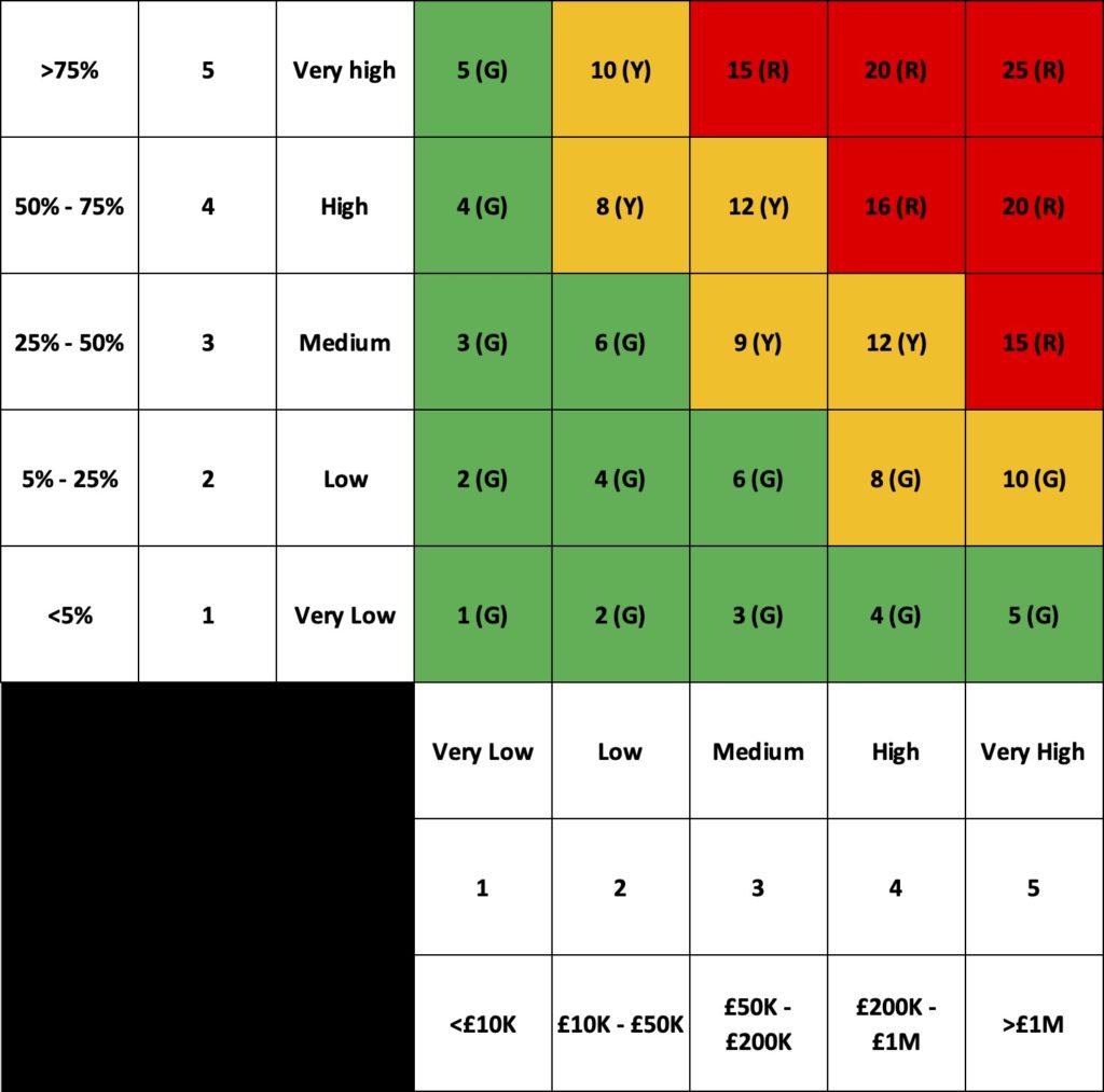
It consists of a series of ordinal levels, 3×3, 4×4 and as shown below often 5×5 as these are easy to represent on a matrix. These ordinal values may represent an equal split of the possibility space (being of equal size) or commonly for the impact scale represent some log-like scale of increasing harm intervals to ensure that small risks and very large risks can be more easily manipulated and compared.
Often these ordinal numbers representing the risk estimation data are subject to further mathematical manipulation such as summing or multiplying the ordinal scores together to get a further simplified single score for the risk that allows for prioritisation in lists.
Similarly often a risk appetite or risk tolerance is set through the use of categorical colour schemes such as Red/Amber/Green or Black/Red/Amber/Green to identify risks that are acceptable and those that are not for non-specialists to consume. The simplified risk scores will be assigned to these categories to aid understanding.
Often in security you will see ‘inherent risk’ and ‘residual risk’ scores plotted on the same PIG to show the effect of a change or investment on the overall risk profile.
One of the main issues with relying on the simplification of risk data in PIGs to assist decision making is that it can actually become harder to distinguish and prioritise risks.
Figure 2 below shows five possible risks using the example PIG in Figure 1. These have been carefully chosen to highlight some of the issues but are not unreasonable values.
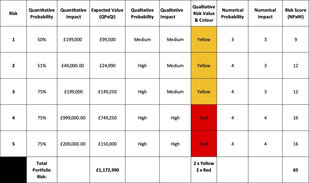
The first three risks are all Yellow risks, and yet the expected value of the risks using a naive Quantitative probability multiplied by Quantitative impact are across a wide range from approximately £25,000 to £150,000. I have found that when you present real world examples of the range underlying a simple signifier such as Yellow stakeholders become uncomfortable. The last two risks make this case even stronger and show the effect of a log-like scale on impact with a range of expected values for Red risks from approximately £150,000 to £750,000 a significantly higher range. In fact risk 3 and risk 5 both have the approximately the same expected outcome but one is Red and one is Yellow.
The Risk scores generated from multiplying the ordinal numerical probability and numerical impact present similar challenges. Risks 2 and 3 both have a risk score of 12, the same for prioritisation when presented in a list but their expected values differ by £125,000 whereas risk 1 has a lower score of 9 and an expected value nearly four times that of risk 2. Placing risk 1 below risk 2 for prioritisation based on their risk scores results in an irrational outcome when their expected values are known.
These all represent the dangers of reducing rich risk data from estimation to simple ordinal values that make mathematical manipulation and presentation easier.
If we extend this analysis to all of the best and worse cases available in each square of the PIG and consider the categorical colours of each square we can see there is the potential for serious overlap between quantitative expected values between the Reds, Ambers and Greens. Not what stakeholders expect.
Figure 3 below shows the results of calculating the best case and worst case for each square of the PIG and identifying the minimum and maximum possible values for each.
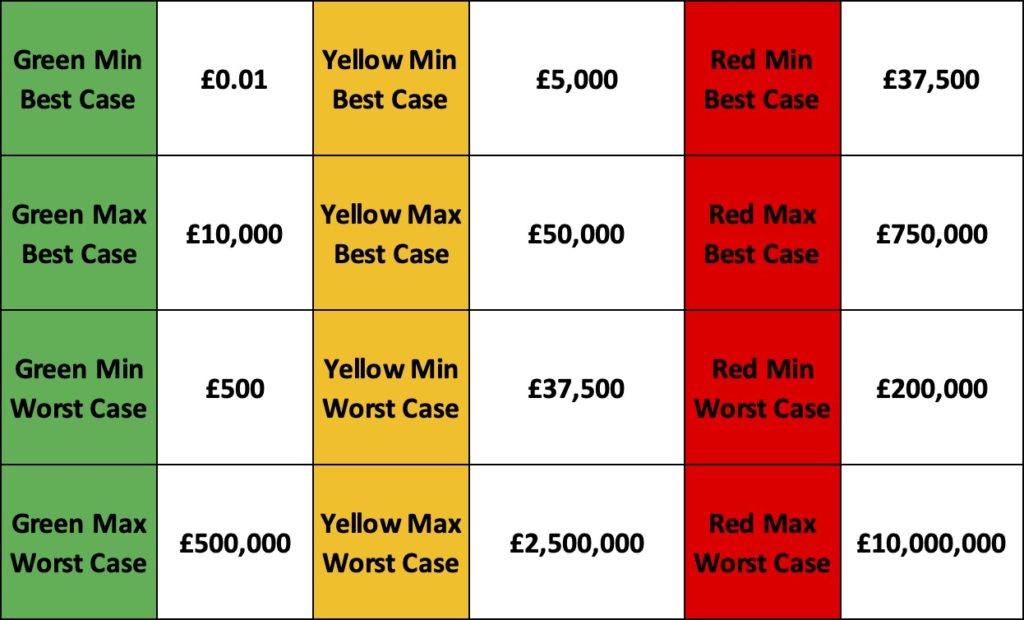
The ‘Green Min’ is the square with the lowest values for green and the Best and Worst cases represent the highest and lowest possible expected values for that square.
There is also a systemic problem when using multiplicative math on the ordinal values separate to the fact it can produce irrational recommendations compared to the expected value of the risks. The structure of multiplying the values together actually makes the prioritisation harder by reducing the choices available to the decider.
Even if we assume we have only one risk of each combination of possible probability and impact ordinal scores the simple multiplication actually reduces the range of risks to a smaller set of risk scores. easier to understand but now harder to distinguish.
As Figure 4 shows below, for the 25 risk outcomes there are 21 possible scores available but when we remove the duplicates of the same scores there are in fact only 14 unique scores available. the multiplicative risk score has actually reduced our ability to distinguish between the 25 risk outcomes to 14 scores!
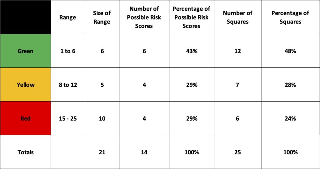
This produces clustering of similar risk scores for dissimilar risks which is not as helpful to the decider as it is easy for the practitioner
One of the most dangerous aspects of PIGs and multiplicative risk scores is the risks that are very low probability but very high impact are obscured within the general category of Green or similar. The business ending risk is just fine.
The danger with these sorts of risks is that they are often classified as such due to a low strength of knowledge rather than a good estimate of their realistic likelihood, ‘we haven’t see it so we will assume it’s rare’. This is where the much vaunted ‘black swan’ risks can be found after the event that is disastrous. They’re sitting there known about but discounted due to both low strength of knowledge and them being obscured in low concern buckets by categorical multiplication. Here be dragons.
This has been a long post and I haven’t yet touched on the extensive academic work by Tony Cox, Douglas Hubbard et al on the problems inherent in risk matrices or PIGs. I will likely revisit that in a future post but for now the issues presented here are more than enough for me to both reject PIGs and multiplicative risk scores for supporting better decision making and prioritisation.